
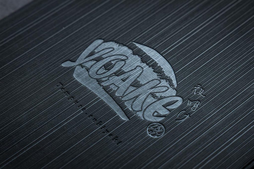
Embossing is a refined finishing technique that can be applied to the logo area of your menu book cover
Unlike foil stamping, embossing creates a tactile raised effect without using metallic foil—meaning the logo appears subtly through light reflection rather than bold shine. This understated finish can evoke a sense of mystery and sophistication when used thoughtfully.
While many clients opt for foil stamping to highlight their brand logo more prominently, embossing offers a unique design aesthetic that, when executed well, can be even more visually compelling. Ultimately, the choice between embossing and foil stamping depends on your personal preference and brand style.
What Is Embossing?
Embossing is a process that uses heat and pressure to press a metal die into the surface of a material, creating a raised, three-dimensional effect. It has long been used in luxury book covers, stationery, and branded packaging. The metal die is custom-made to match your desired font, logo, or graphic, allowing for a highly personalized and elegant result. The final product not only looks refined but also enhances tactile quality and collectible appeal.
Design Considerations for Embossing
To achieve the best results, keep the following design tips in mind:
- Consistent Line Thickness
Uneven line widths can lead to inconsistent pressure during embossing, resulting in a blurred or uneven finish. Aim for uniform line thickness throughout your design. - Avoid Overly Detailed Graphics
Embossing is a physical process, not a print. Extremely fine details may blur or flatten under pressure. Maintain adequate spacing and balance between design elements to prevent interference. - Keep It Simple
Simpler designs tend to highlight the embossed texture more effectively. For example, pairing a monochrome title with matte black foil can create a luxurious look. Focus on layout and balance rather than excessive decoration.
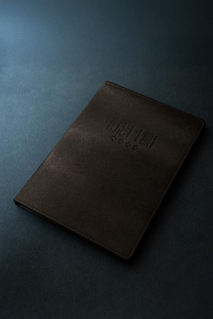
Material Selection & Finish Variations
Embossing can be applied to a variety of materials including leather, paper, fabric, and thick cardstock. However, the final texture and detail clarity will vary depending on the material used. We recommend understanding the characteristics of each material and conducting sample tests if needed.
The color of your cover and the font style also play a significant role in the visual impact of embossing. Choose elements that align with your menu’s theme and your restaurant’s concept. Embossing is more than just a decorative technique—it’s a powerful way to elevate your brand’s professional image and recognition.
Embossing for Menu Book Covers: Design & Production Insights
Embossing is widely used as a finishing touch for menu covers. By applying heat and pressure through a custom metal die, it creates raised lettering or graphics that enhance both texture and visual appeal. This technique has a long-standing history and remains popular in premium printing and packaging.
At Phototora, we produce a dedicated metal die for every order, allowing you to freely choose fonts, graphics, and logos that reflect your brand identity. This makes embossing an ideal choice for restaurants seeking a distinctive and professional presentation.
Key Design Tips for Embossing
To ensure a flawless finish, consider the following during the design phase:
- Uniform Line Thickness
Thick lines require more pressure, while thin lines may deform under excessive force. Mixing line weights can compromise clarity—opt for consistent widths. - Avoid Overcrowding
Embossing doesn’t handle fine print well. Maintain sufficient spacing between elements to avoid blurring or distortion.
Simplicity Enhances Texture
Minimalist designs allow the embossed effect to stand out. Even a simple title with matte foil can exude elegance. Prioritize layout and balance over embellishment.